CONCEPT:
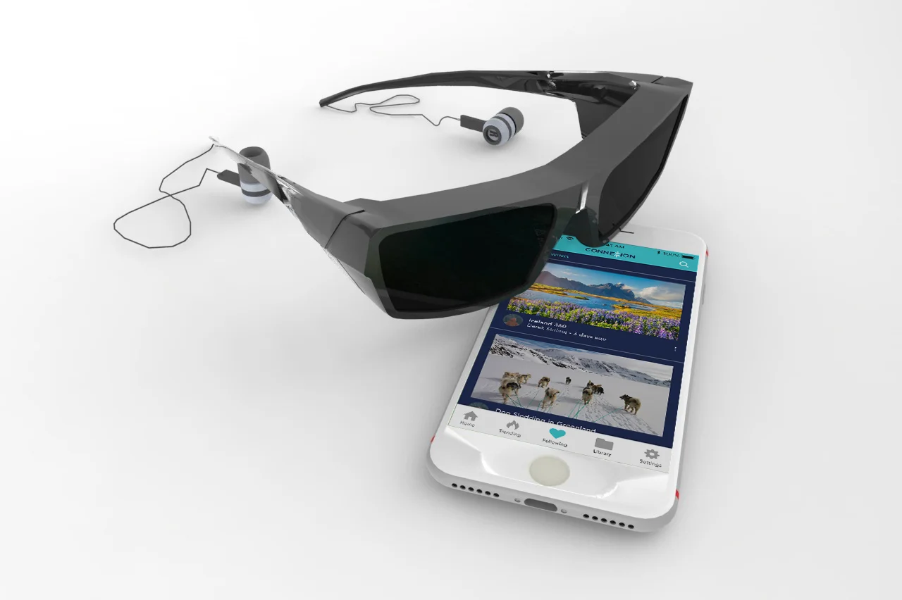
Connexion is a virtual reality application that allows users to experience adventures and activities that they’ve only dreamed of through the eyes of full-time travelers. Now the disabled, old, and sick can climb Mount Everest, bungee jump off the world’s highest bridge, and go deep sea diving. Extreme travelers are now given a purpose beyond just sharing their moments through film or photography by allowing others to live through their eyes. Connexion features a multi-user option so that those using and viewing the 360-degree videos can do so with a friend or family member so that they don’t feel while doing so.
My objective was to create an application design that would be both user-friendly and intuitive.


COMPETITIVE ANALYSIS
I did a review of other VR applications to see what is and isn’t effective. I also looked at industry leaders for inspiration.
INTERVIEWS
I wanted to get inside the head of someone who experiences challenges while traveling so I interviewed a woman who is physically handicapped. She cannot walk without a cane and often needs a wheelchair or scooter to travel any sort of longer distance. She is also overweight, so she faces challenges physically fitting into travel-associated spaces as well. She preferred to stay anonymous for this interview.
PERSONA
I created user personas to realistically represent key audience segments. I didn't need to represent every possible audience member but rather address the major needs of the most important user groups. Meet Debbie, a handicapped retiree who is frustrated with her travel limitations.
EMPATHY MAP
I created an empathy map to understand my users, organize my research, and to drive a human view rather than technical view of Connexion. Empathy maps are used to understand and communicate the problems and mindset of users in an easily digestible manner.


SITEMAP
A sitemap was created to show the relationship between the content in the application.
TASK FLOW
I identified the main flow that users will follow to complete the main tasks (searching for a video, watching it, viewing traveler profile, and then following that traveler). A path was created to the key screens that would become part of the site design, also known as the "happy path" of Connexion.
USER FLOW
A user flow was created to represent the different paths that a user would take through the site to complete each task.
WIREFRAME SKETCHES
Created low-fidelity sketches of the main pages within the application to get a rough-and-dirty idea of where items will be placed.
WIREFRAMES
Wireframes were created to illustrate the overall layout of the product interface.
LOGO CREATION
Connexion logo concepts created and narrowed down to final logo design that represents the letter "X" as two arrows pointing towards one another or "connecting". The typeface used was clean, modern and geometrical to keep it up-to-date since this application is in the tech market.
STYLE TILE
A style tile was created consisting of fonts, colors and interface elements that communicate the essence of the visual brand for the Connexion application.
UI KIT
Next, I created a UI kit. It included the user interface components which convey meaning and provide functionality to users.
PROTOTYPE CREATION
The testing phase is the greatest opportunity to improve products by studying how people respond and interact with ideas. I created a functional prototype with clickable buttons, simulated page transitions and animations that roughly matched my experiential concepts for usability testing.

USER TESTING
Next I took that prototype and put it in front of some users to see how well the design ideas played out.
INTRODUCTION:
Four users were tested. They were aged 32-62, both male and female. The tasks were to sign into the application as a new user, search for videos from Iceland, play the first video, view the traveler’s profile, follow that traveler, and check your “Following” feed to make sure that new follower shows up. This test was done remotely via Skype. Introduction was done via video chat and then test was done using screenshare. The prototype itself was tested with a link from InVision. After each test, I asked them feedback about their experience, what their pain points were and how they would improve the interaction.
SUMMARY OF RESULTS:
All users completed the task with no errors
Suggestion for change: Add video lengths to preview screens
2 of 4 users were confused by testing a phone prototype on a computer
3 of 4 users mentioned enjoying onboarding screens and thoroughly read through them
4 of 4 thought the design was intuitive and straight forward
3 of 4 users went through test more than once without being asked to
AFFINITY MAP
I wanted to step back and see the big picture of my results so I created an affinity map. By labelling groups and sub-groups, I can visually see where the main issues are.
REVISED PROTOTYPE CREATION
I made revisions to my design work based on feedback from my evaluative research. I had to determine what were the biggest priorities to change. In this stage, I would continue to make revisions and complete usability tests until the design is a success without any usability issues.